Case Study: Virgin Wines
In our group project, we conducted a heuristic evaluation of Virgin Wines, focusing on their events, about us, and checkout pages.
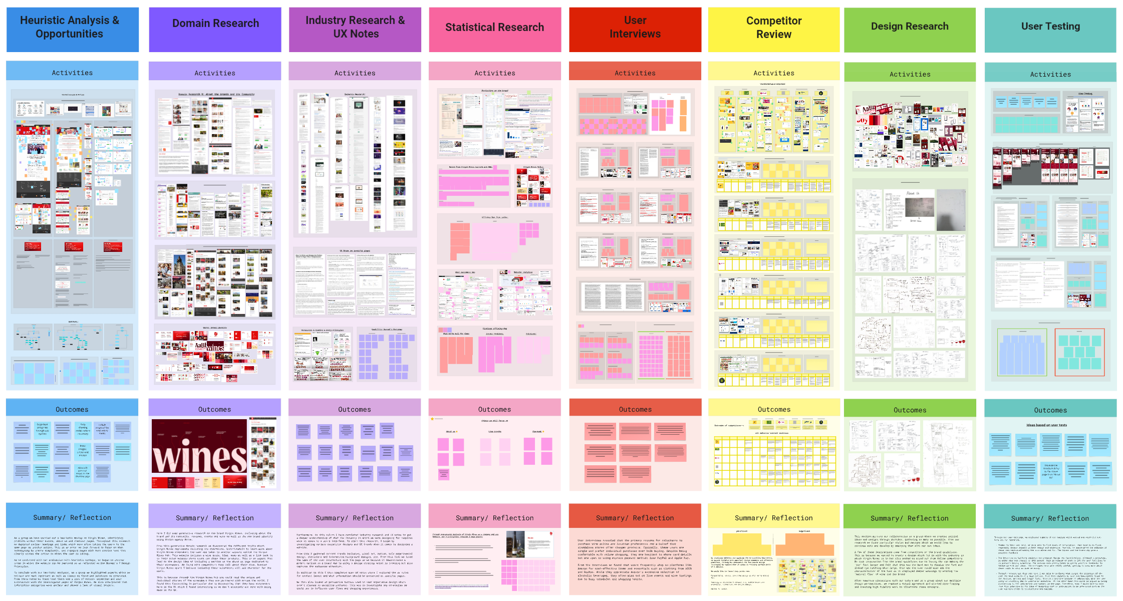
We discovered issues such as unclear headings and repetitive links, where multiple actions led users to the same page. Our plan for redesign involves simplifying these pages to create more engaging content with clear, concise text that better directs user actions.
Through our evaluation, using Don Norman's 7 Design Principles, we identified key areas for improvement. These included enhancing user interaction and adding motion or animation to make the website more dynamic. We also noted a need for clearer categorisation of information and more visual imagery to enhance user engagement.
Overall, our heuristic analysis helped us pinpoint critical flaws and devise potential solutions, aiming to improve user experience on the Virgin Wines website by making it more intuitive and visually appealing.
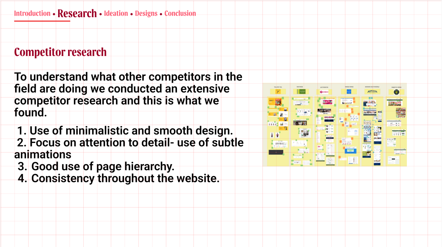
To gain a complete understanding of the industry, we analysed the strengths and weaknesses of five main competitors. Our competitor research summarizes the value proposition, target audience, and an overall analysis of their website design. While there were certain downsides to the websites, we decided to focus on their strengths.
We found that the websites made good use of hierarchy and content organization
techniques to make content easy to read and follow, incorporated subtle
hover-over animations, and implemented smooth interactions, highlighting
attention to detail and improving user experience.
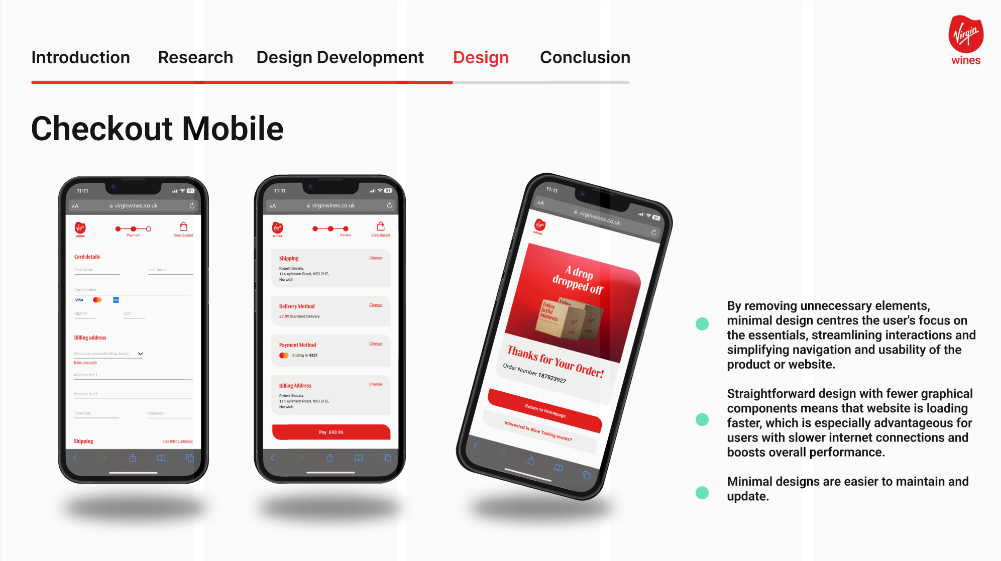
With respect to our findings, we focused on three main aspects:
1.
Minimalistic,
smooth design.
2. Focusing on attention to detail - features like
interactive
animations and making the overall design intuitive.
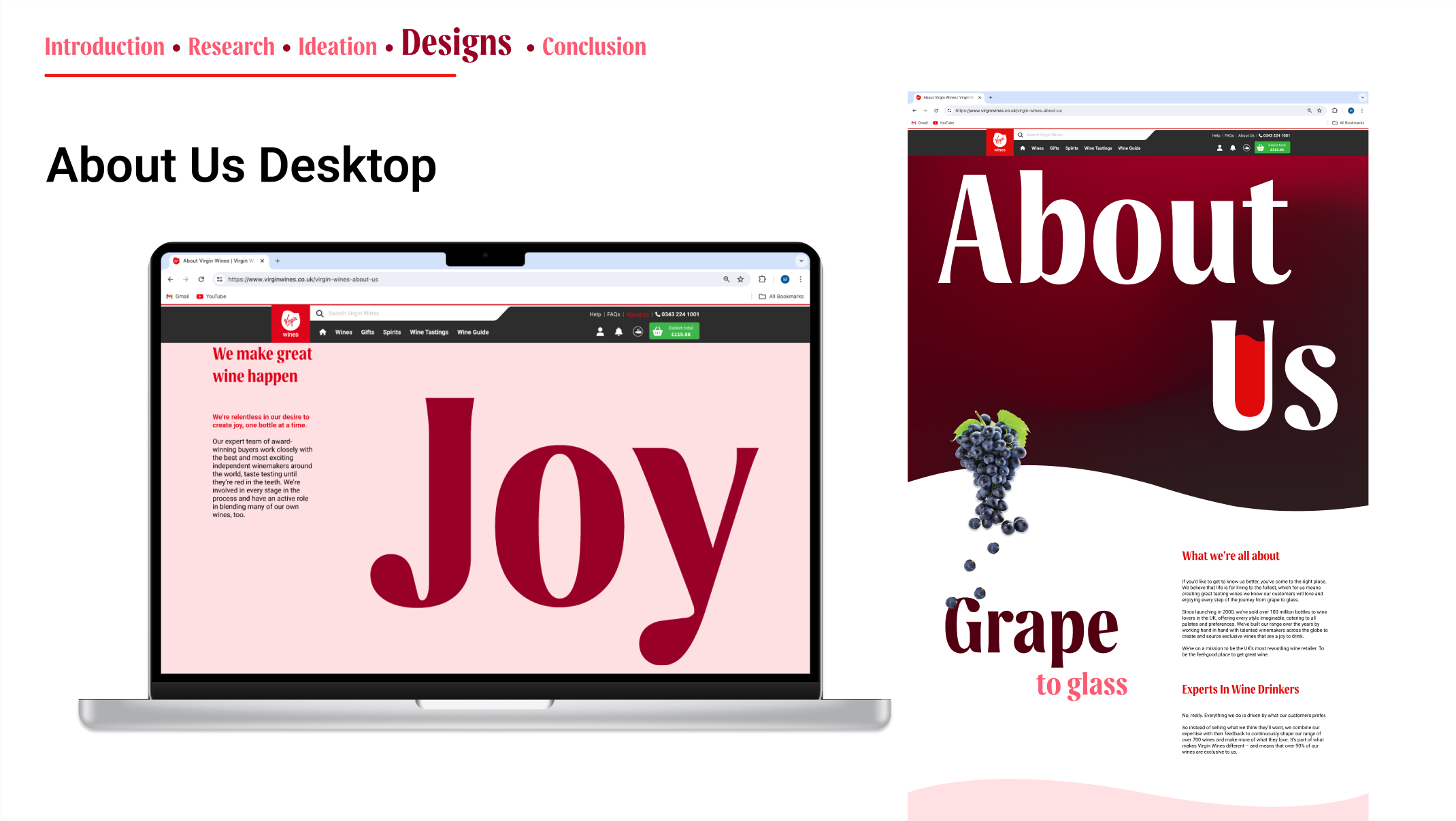
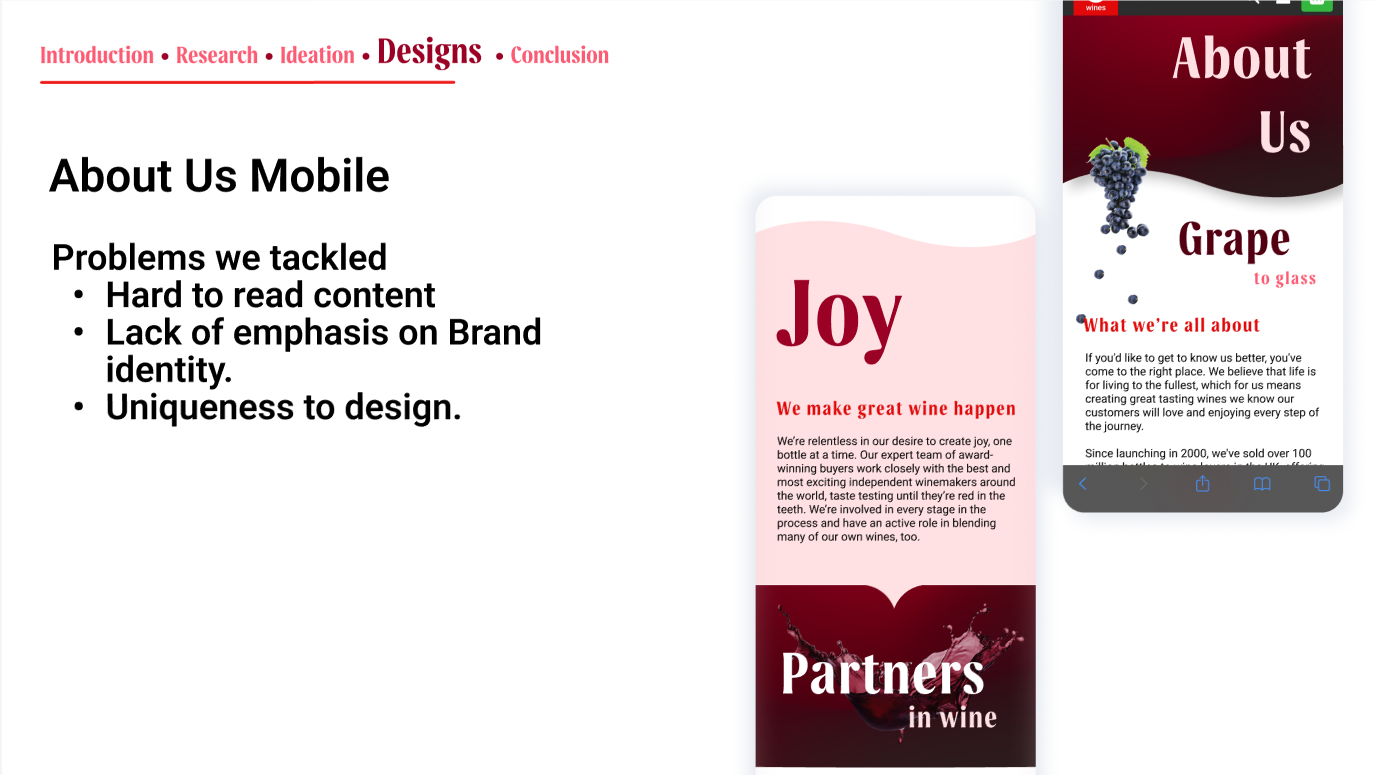
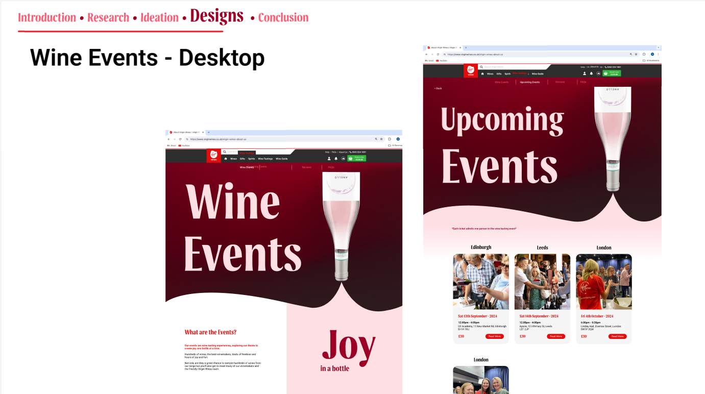
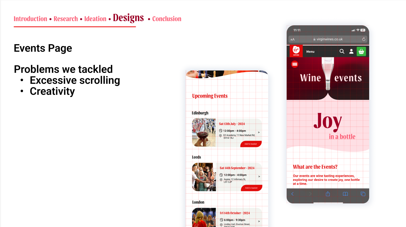
Designs we made